
 We were fortunate to have as friends and colleagues several of the people responsible for the leadership of the Morton Salt company. Fine people all, and a very interesting business. Tito, you will surely ask, it's salt; what could possibly be interesting about salt? Well, like most businesses, Morton had its challenges, its complexities. But for the purposes of this post, it is interesting also because it has a memorable and beloved icon, the Morton Salt girl.
Let's Hear It for the Girl
Long before any of us were alive, salt was salt, as it is today. But for a short period at the the beginning of the last century, Morton had a better salt. Salt, it seems, is very good at absorbing the humidity in the air. When it does it turns into a solid brick that needs to be broken and pulverized before each use. That is, it did until Morton added magnesium carbonate to their salt which allowed it to flow freely even in the dampest weather.
Please be patient dear readers, this is coming to a point, and one in fact which may be lost on some marketers today.
Morton asked the Doner Agency to develop advertising to inform the world of their breakthrough. Doner developed the Morton icon, the little girl carrying an umbrella in one hand and an upturned container of salt, spilling freely, in the other. They also added the tagline "When it rains, it pours".
You see none of us, or perhaps more accurately, few of us, know this fact about salt, or about Morton's innovation, or need to know. All salt companies now add a little something to their table salt, an "anti-caking agent", which allows it to flow freely. Those drawing breath today do not know a world with salt that cakes. Yet almost one hundred years later, Morton still uses the same tagline, and the same icon, freshened to match the progress of fashion, on its blue round containers of salt.
And while Morton spends very little on advertising (about $4 million per year the last time we checked), it still dominates the salt category and draws about a 30% price premium compared to its competitors. Same product as the competitors, same container, no heavy marketing spend, a no longer relevant tagline, but a 30% price premium.
The fine people at Morton Salt know all this, and they know that women love the little girl. When they were small, they saw the icon in their mother's kitchen, and when they use it today, their daughters see the icon also. It may be salt, but to them the little girl represents quality, and timelessness, connection, love, and the care displayed by their mother.
The last time a little girl worked this hard was at a Nike shoe factory in China.
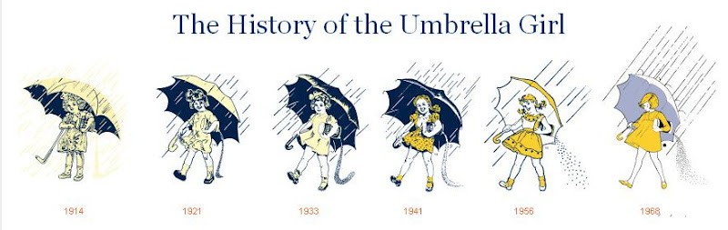
Please glance at the evolution of the little girl icon below and think of the great forebearance of these leaders of the Morton Salt company. Do you detect anywhere the sweaty, grasping hand of a CMO looking to make their mark?
Draw the Short Straw
Our friends at Morton have reappeared in our thoughts recently, precipitated by news coverage of the plight of Tropicana orange juice, its redesgned container, and Peter Arnell, whose Arnell Group was charged with refreshing the brand's imagery.
Tropicana Pure Premium orange juice, a PepsiCo brand, has been the leader in their section of the supermarket for many years because of it's product quality, heavy advertising spending (reportedly $35 million annually), and a stable of loyal brand fans. With flat growth in the overall category, the company looked to new advertising and new packaging to help grow sales.
We at marketmambo have never impressed anyone with our design judgment, but to our eye the new Tropicana package looked more appropriate for a generic store brand. Gone is the
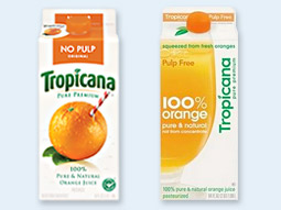 familiar straw piercing the orange, now replaced with an image of juice in a glass. Isn't orange juice, regardless of the brand, typically served in a glass? The new type treatment loses its tropical references and is placed vertically and to the side. Tropicana branding now appears secondary to "100% orange".
We don't know if others agree with our reaction, but the new Tropicana packaging has not met with the hoped-for success. During the first two months of this year, the period of the launch of the new design, unit sales of Tropicana fell 20% and total dollar sales dropped $33 million. Bloggers and their readers were unforgiving of the makeover given their brand. According to Neil Campbell, president of Tropicana North America "We underestimated the deep emotional bond...The straw and orange have been there a long time, but people have not necessarily had a huge connection to them". Mr. Campbell has announced that consumers should expect to see the old version of the container return to the shelves shortly.
The new container design was the work of the Arnell Group, which last year took over the advertising for the business from Element 79. For so young of a year, Arnell had already received much criticism for its work on Pepsi's flagship cola brand. The redesigned Pepsi logo launched with great fanfare for the Super Bowl, and some say, bore too close a resemblance to the logo used by the Obama presidential campaign. Since then, an internal Arnell branding document has circulated entitled "Breathtaking Design Strategy" that positioned the agency's Pepsi work as the latest manifestation of historically great design which includes Pythagoras, Da Vinci, and Arnell's immediate predecessor in this lineage, Le Corbusier.
Mr. Arnell has not commented on the "Breathtaking" document, but regarding the negative reception of the redesigned Tropicana logo has said "I'm incredibly surprised by the reaction".
But we can imagine the pleasure in many hearts in Atlanta. Coca-Cola's Minute-Maid has grown in sales, not quite gulp for gulp, as Tropicana has stumbled. And though twenty years have passed, old-timers at the company can take perverse satisfaction that Tropicana has become PepsiCo's "New Coke".
__Links__________________________________________________
For the article including the quotes from Mr. Arnell and Mr. Campbell, click here.
And to view the Arnell "Breathtaking Design Strategy" document, click here.

No comments:
Post a Comment